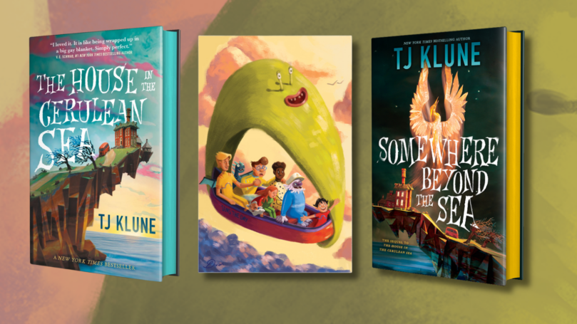
Immerse yourself in the Cerulean Chronicles through the eyes of artist Peyton Dixon! Before we dive into Peyton’s insights, don’t forget to pre-order TJ Klune’s Somewhere Beyond the Sea and submit your receipt here by 9/9/24 for a chance to receive Peyton’s stunning artwork!
By Peyton Dixon
I first discovered The House in the Cerulean Sea in 2022, after it was recommended to me by my sister. I was searching for a warm, visually rich book that I could be inspired by to create a new portfolio, and I was enchanted by its wonderful characters and gorgeous setting. I worked for a year creating a collection of art, hoping to bring some of the book’s magic alive, and to my complete disbelief, it was adored by TJ and his readers. This led to Tor Books reaching out for a pre-order commission for TJ Klune’s new novel Somewhere Beyond the Sea and the opportunity to work with TJ and his amazing team directly.
In the first novel, I was instantly struck by the symbolism of blue. Whether it was the lifting of the rain and Linus seeing the ocean for the first time or the blue in Lucy’s eyes, balancing the red, TJ’s use of the colour had to be woven into my work. I felt that blue was the connection between all the characters, a symbol of their collective home. All the characters in my work inspired by the first book and the pre-order commission have a touch of blue, illustrating their connection to the other characters, the island and their personal growth through both novels.
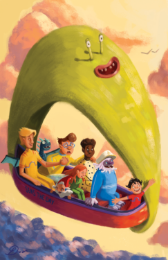
I was so thrilled to be given one of the treasured ‘Adventure Days’ to illustrate, which came with some delightful new costumes for the whole gang. I knew I wanted to be as faithful to Chauncey’s outfit choices as possible while reflecting everyone’s personalities and their hints of blue.
Linus’s blue is not only in his glasses, as his love for his family has changed his perspective, but now striped along his wetsuit because love has changed his whole being. He is honestly one of my favourite characters and was actually the first I designed for the project. I couldn’t stop giggling at the idea of his very form-fitting wetsuit that he absolutely rocks! (and no more bland suits!)
Arthur’s blue is striped across his heart. His love for his family is a point of pride for him, and he’ll always display openly. Talia’s blue is the Mexican Morning Glory tucked into her hair. A symbol of her connection to the home that she is proud of and willing to protect. Sal has grown since the last book and because Chauncey did pick out a fabulous wetsuit for him, I hid his blue in the dots on his wetsuit.
The love and support from his family have been absorbed into a strength uniquely his own but not one necessarily obvious. Phee’s blue is her wings. When standing this blue surrounds her and is a symbol of the journey of self-discovery she is making as she grows into her power, supported by her family.
Lucy’s blue is in two places. His eyes are rimmed with red, signifying the battle of nature vs nurture and the love continuously backing him. And on his wetsuit, mirroring Arthur whom he looks up to. This was a design choice I brought from my previous work. I had Lucy mirror his father’s fashion choices as a way of trying to emulate him. He looks up to Arthur after all, and I’d expect some matching father-son outfits.
Chauncey’s blue is the name of the boat. It is his adventure day, and he painted it himself. His blue represents his freedom and curiosity, nurtured and shared with his family, much like his entire ‘yachting’ day. He worked very hard on the handwriting, which is tricky without hands.
Lastly, our new addition, David. His blue eyes symbolise he was always meant to call the island home; it’s built into him and his wetsuit, a literal way he is surrounded by love. After all, Chauncey insisted on his suit, and the colour absolutely complements his hat.
You can find development for this pre-order campaign and my The House in the Cerulean Sea inspired work here: https://peytondixon.carbonmade.com
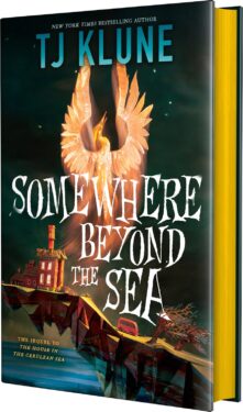
Pre-order Somewhere Beyond The Sea Here:
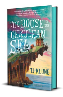
Pre-order the special edition of The House in the Cerulean Sea Here:



Leave a Reply